Tuesday, January 26, 2016

Len Lye Centre, New Plymouth


This summer I took a road trip and visited two regional galleries in New Zealand. The first stop was the Len Lye Center and Govett-Brewster Gallery in New Plymouth. The new Len Lye Centre opened in 2015 and has attracted alot of attention since. It was interesting to visit a regional gallery that has managed to make such a large impact beyond its’ immediate region. Like all good aspiring art galleries, the architecture by Patterson Associates is avant garde, unusual and makes a bold statement. 


The shiny and highly reflective marine grade stainless steel surface of the building continues along two curved, rippling facades. The repeating forms reflected in these reminded me of some of the Len Lye films screened inside with their jumping rhythmic film frames. The striking facade is an excellent counterpoint to the large, stainless steel kinetic sculptures exhibited inside. Whilst photographing the facade a couple of women walked past and one remarked “ I hate that building, it looks disgusting.” Regardless of some negative opinions it seems likely this new building will be hugely beneficial in developing cultural tourism to the region. Whilst I was there children were having a great time peering at their distorted images in the mirror-like surface - a facade for the selfie generation perhaps? 


The Len Lye exhibition inside the building gives one a good introduction to his work and left me wanting to see more. I liked the way the steel fountains create an ever-changing series of forms as the steel rods move and shimmy. It was a delight to photograph and observe these, they reminded me of the (somewhat static!) metallic lines in some of my earlier paintings.


I was excited to come across an exhibition in the Govett-Brewster section of work by an artist I was not previously familar with. Sister Corita was a Roman Catholic nun (1918-1986) who produced and taught art in Los Angeles in the 1960’s and later in Boston. Her screenprints look extraordinarly modern and fresh, like they were produced yesterday, a reminder of how much we owe to the recent past. She used elements of popular culture to produce bright and thoughtful works. These often have a political undercurrent. I found her work fascinating and the inclusion of contemporary record covers and some posters from New Zealand by Wellington Media Collective made for an interesting show. 

If you miss seeing this show at the Govett-Brewster it will be travelling to the City Gallery, Wellington later this year. http://citygallery.org.nz/exhibitions/sister-coritas-summer-love

Sunday, January 17, 2016

Sarjeant Gallery, Whanganui


Last week I was fortunate to have the opportunity to visit the Sarjeant Gallery Te Whare o Rehua Whanganui with Senior Curator Greg Anderson.

The beautiful original building from 1919 sits in a prominent position near the town centre, with impressive views from front and back. Sightlines were obviously a big consideration in the design and planned redevelopment will preserve and enhance these. Prior to shifting the collection out of the gallery a section of the masonry ceiling fell out, grazing the marble bust of gallery founder Henry Sarjeant and revealing further damage underneath. It was obvious that the time had come to take action. Rated at only 5% of the current new building code, the original building is in dire need of earthquake strengthening and basic restoration, with various types of damage visible throughout the structure. Previous collection storage in the basement was also very inadequate. Luckily the central dome (pictured) remains intact although that too will require a degree of strengthening work. 

The gallery has an interesting and significant art collection of over 8000 items. I caught a glimpse of some of these works in storage ranging from historic European painters through to prominent New Zealand artists. Protecting it has been a challenge given the state of the building - no environmental or lighting control. Just getting access to items was a major issue in the confined spaces of the old excavated basement below the original building.  


In preparation for redevelopment and to mitigate earthquake risk the collection has been moved and a temporary location for the gallery at 38 Taupo Quay has opened. Fortunately the art collection was safe from recent floods which damaged much of this area of Whanganui, although the gallery space of the temporary building did have to be repaired. Moving the collection has been a huge but rewarding task. Over two thousand items with little or no documentation were uncovered during the process and inventoried. Some of these items will no doubt prove interesting to art history students of the future and will provide the gallery with previously unseen material for future exhibitions.


When the redevelopment occurs a new wing will be added to increase exhibition, education, amenities and storage space for the art collection. The design and position of the new wing behind the original building will ensure that the historic old building will still be the main feature visible from the town centre. View the flythrough here: http://sarjeant.org.nz/flythrough/


At the Sarjeant’s glass and object gallery located above the Whanganui iSite at 31 Taupo Quay, there are some intriguing works currently on view. Above the Whanganui tourism site are cast glass works by Emma Camden. These large, weighty forms reminiscent of architecture are really beautiful. Whanganui has a strong tradition in this area and it will be interesting to see more works in glass in future exhibitions. 


In the main gallery at 38 Taupo Quay there are collection works by Vivian Smith and Mary Green, artists who taught at Whanganui Technical College. The William Morris influenced floral designs are particularly appealing. Contemporary works on display include portraits of opera singers participating in the New Zealand Opera School in Whanganui by Felicity Priest, and a large work entitled “The Horses Stayed Behind” by Cat Auburn. This work by Cat Auburn is made of a multitude of Victorian style rosettes created from donated horse and pony hair, each identifiable and spread across four large panels.
More information about this work can be found here: 

Securing the funding for the proposed redevelopment of the Sarjeant Gallery Te Whare o Rehua Whanganui has been an extremely challenging task and it is a testament to the perseverance and dedication of Greg Anderson and his team that a significant portion of the funding required has already been secured. A quote on the wall in the staff area (pictured above) gave me some sense of just how daunting it must have seemed at times given the setbacks and the scale of the tasks involved.


Some of the larger works requiring restoration need additional funding to carry this out and hopefully donors can be found for these. It will be very exciting to see the whole project finally go ahead and it will undoubtedly have a positive impact on the city, the region and New Zealand culture. It will be a real pleasure to see a vision fulfilled at the opening in 2019 of the restored gallery and new wing.


Above: A beautiful large work by Edward Burne-Jones under wraps whose frame is awaiting conservation.


Friday, August 14, 2015

Damien Hirst at the Tate Modern


An artist recently told me an anecdote about Damien Hirst, it concerned an assistant who worked for him and who was reprimanded for speaking to Hirst at a staff party. Anecdotes such as this seem to be relatively common when talking about Hirst. Sometimes it is difficult to look at his work without bringing to it an awareness of all the gossip and cultural baggage that has accompanied his career and success. 

Claims of plagiarism have also provoked legal proceedings and perhaps undermined his position as an important artist. For example, the LA based artist Lori Precious claims Damien Hirst stole her ideas. She exhibited works composed of butterfly wings in the late 1990’s, years before Hirst exhibited works that are very similar. One wonders if Hirst’s assistants had to spend hours pulling wings off dead butterflies.

On a cold grey day in London I visited the large Tate retrospective of Damien Hirst’s work, (April-September 2012). One of the early works caught my eye - Boxes, 1998. A simple installation of brightly coloured cardboard boxes painted with household paint which clustered around a corner of a gallery space. It is a work that is designed to be variable and “fabricated new each time it is exhibited; it is a fixed number of boxes that may take any form.” (from the small guide to the exhibition). Something about the informality, budget materials and bright colours of this work really appealed. In contrast, some of his works use rather more expensive materials - “The Anatomy of an Angel”, 2008 is carved from Carrera marble and will no doubt last hundreds of years. 

Many people are also familiar with “For the Love of God”, 2007 Hirst’s sculpture which is a platinum cast of a skull encrusted with diamonds. This work has also been subject to claims of plagiarism, this time by artist John LeKay who produced a crystal covered skull in 1993. At the time the sale of “For the Love of God”, and subsequent media coverage created considerable publicity for Hirst. The work was eventually purchased by Hirst and an anonymous consortium of others. In works such as “The Golden Calf”, a calf with hooves dipped in gold, Hirst seems to mock the wealthy collectors, the curators and audience, “worshipping” a false idol, echoing the Bible story from Exodus where the ancient Israelites create and worship a golden calf because Moses is so long up Mt Sinai. 

Hirst’s preoccupation with death was apparent throughout the exhibition. “A Thousand Years” 1990 consists of a glass case with a severed cows head in it, which flies feed upon. Some are zapped with an insect-o-cuter and others reproduce. It is a really confronting and morbidly fascinating work. I’m not sure how people generally react to this work but it’s fair to say it probably prompts a feeling of disgust and perhaps a sudden inclination to embrace vegetarianism upon viewing. One of the things that has really stayed with me from the exhibition was the smell, not of rotting meat but a strange, unpleasant sort of metallic chemical smell, perhaps from the formaldehyde works.

Another work in the exhibition also used living creatures, this time living butterflies, in a work entitled “In and out of love”. Butterflies hatched from canvases with pupae attached. The room was filled with living and dying butterflies. A modest row of plants offered the butterflies some habitat. Tables with ashtrays of cigarette butts were also part of the installation. It suddenly felt like being in some small child’s nightmare. I can not help but contrast this part of the show with the fascinating Sensational Butterflies show at the Natural History Museum that we took our son to in 2013, which also had butterflies going through their life cycle but in a rather more lush and green setting.

I found the spot and spin paintings dull and unoriginal, but “Pharmacy” 1992, a replica of a pharmacy with cabinets full of pill boxes was interesting and the room full of surgical instruments was again morbidly fascinating. The displays in this room prompt the audience to contemplate death and the fragility of life. Hirst has been inspired by museum displays and this is a strong theme in his work. The animals in formaldehyde are scaled up versions of the sort you would see in a natural history museum.

I think after viewing an exhibition like this one I needed a good dose of something life-affirming, like a walk in the sunshine or a hug from a loved one. Unfortunately the grey London day did not provide any sunshine but I had better luck with the hug. I’ll make sure my next blog post is about something more joyful - I’ve got just the exhibition in mind.

Celeste Sterling, 2015

For plagiarism claims have a look here:


The Tate Gallery has a run through of the show with Hirst here:

Saturday, August 01, 2015

Olga de Amaral at the Louise Blouin Foundation

A Beautiful Exhibition - Olga de Amaral, October 2013.


One day in London I took a train to the Louise Blouin Foundation to see an exhibition by an extraordinary artist.

Olga de Amaral is a Columbian artist who has spent her life working with woven thread, especially linen and cotton woven together. She also uses acrylic paint and gold leaf on these fabric strips. She says of these strips:

“These woven fragments are the “words” I use to begin creating landscapes of surfaces, textures, emotions, memories, meanings and connections.” (p.208 Olga de Amaral, the Mantle of Memory.)


These beautiful and compelling works cross the boundaries between fabric, sculpture and painting. They are stunning to see in person.  The titles intrigued me - Escrito, Alquimia, Strata, Lienzo, Luna Oro to name a few. Some of the works seem deceptively simple at first, but looking closer one becomes aware of the layers of complex threads, changes in texture, differences between the front and back of the weaving and the shimmering, changing light on the surfaces. At one point I had the odd sense that someone had taken one of my early works and turned it into a hanging sculpture. But what a sculpture! It was humbling and enlightening to see an artist working with gold, silver and intense colour and thread with such amazing results. 


I have seen many exhibitions in my life. I think this will always be one of the most memorable.


Sunday, July 26, 2015

Paul Klee at the Tate Modern


Life sometimes take you in unexpected directions. My formative years and tenth birthday were spent in Victoria, Australia. I do not particularly recall that birthday but we were living in the Dandenong ranges at the time, firstly in Sassafras in the middle of the forest and then in The Basin, a small village in the foothills. My twentieth was in Auckland, New Zealand, whilst I was attending Auckland University. A decade later I was living in Dublin, and celebrated my thirtieth in a small pub in Doolin, on the West coast of Ireland. My fortieth was a quiet affair in London. I awoke late, still jet-legged after returning from a trip back from New Zealand via San Francisco and Los Angeles. My small family and I enjoyed a rare dinner out at our local cafe in Bayswater to celebrate that milestone. I lived in London for two years and during that time was fortunate enough to visit some outstanding art exhibitions. 

On of the highlights for me of the time in London was the Paul Klee exhibition at the Tate Modern (October 2013 - March 2014). It was a wonderful finale to the London sojourn and a real treat to view such a comprehensive collection of work by a really important artist. This show encompassed Paul Klee’s entire career.

One of the first things at strikes you about Klee’s work is the scale - most of the works are small, some a lot smaller than one expects. It is a reminder that artworks do not necessarily have to be large to have merit or impact. I remember a similar surprise when I first viewed artworks at the National Gallery in London which I had previously only known from slides in the Art History department of the University of Auckland and through book reproductions. Van Eyck’s Arnolfini portrait comes to mind in particular, a small intricate painting which nonetheless looms large in the history of art. Klee’s work is likewise often small and encourages the intimacy of close examination. 

The intimate, playful and thoughtful works of Klee’s artistic career are also remarkable for their sensitive use of colour. Klee delved deeply into colour theory. He taught at the Bauhaus in Berlin and Dessau, and colour theory would have been a big component of his lessons. The watercolours in the exhibition are delightful. Whilst they seem simple and almost naive at first glance it is easy to forget just how innovative they were at the time. Klee was influenced by the art of children and paintings such as “Fish Magic” really remind one of this with its delicately drawn colourful fish, flowers and little figures peeking out from the lower part of the canvas.

Unfortunately the Nazis destroyed many of his works and closed the Bauhaus, labelling Klee’s art and that of many of his contemporaries as degenerate. It is difficult to comprehend now how his work was branded as subversive and attacked by those in power.


Klee’s painting methods were experimental and technically innovative, a fusion of surrealist, abstract and expressionist techniques and ideas. A journey to Tunisia was a catalyst for the development of his art. Hopefully one day I’ll have the opportunity to visit an exhibition devoted to the watercolours produced on this trip. In the meantime a search on Google of Klee in Tunisia will suffice to give you an idea of these beautiful works. Travel can offer artists a chance invigorate and refresh their work and to see the world anew, something I am reminded of every time I step outside of my usual circumstances and look around at an unfamiliar landscape.

Wednesday, July 15, 2015

New artist blog

My Arcadia blog has been neglected for a long time, sometimes life takes over - marriage and a child, two years exploring London and beyond. More recently I have built a website to showcase my paintings and as a more personal artist blog. You can find it at www.celeste.nz

Thursday, November 06, 2008

Monet & the Impresssionists


After many travels and a myriad of art museums and exhibitions there's a big gap in my blog waiting to be filled. So many highlights - Marlene Dumas at the Museum of Contemporary Art in Los Angeles and Picasso & his collection in Brisbane come to mind - just a couple of the standout shows I've been privileged to see recently.

I'm going to start with the most recent however - Monet and the Impressionists at the Art Gallery of New South Wales. (11 Oct 2008 - 26 Jan 2009) An unexpected trip across the Tasman had me enjoying some warm Sydney sunshine and seizing the opportunity to see this popular exhibition. Rooms full of gorgeous Monet paintings are hard to resist! Actually, popular is an understatement - at 10.30am on a Monday morning the exhibition was already filling up fast. It is somewhat disconcerting after the relative emptiness of New Zealand to experience the crush of many people. Particularly so when one is transfixed by a flurry of colour and brushstrokes, only to step back and suddenly discover a wall of drones behind, ears glued to the insidious audio guides as they stand obediently absorbing the interpretation buzzing in their ear and proceeding from one painting to the next in somewhat robotic fashion as directed by their trusty audio guide. Forget that I say!

It's not difficult to fathom the enduring appeal of Monet and the associated Impressionists. All the plethora of bad reproductions and tacky tourist paraphernalia plastered with Monets fail to do justice to nor detract from the sheer beauty and shimmering colour of the paintings which after 100 years still look fresh and wonderful. Ironically these fleeting moments in time, "Impressions", have proven to be timeless in appeal.

It is rewarding to look closely at the works - forms dissolve into a web of coloured brushstrokes, colours become discrete. In a small work I have not seen before, "Poplars at Giverny" 1887, I discover the tree trunks are long lavender strokes. There is an intense feeling of light, freedom and energy in these paintings, particularly in the work from the 1880s and also in the in the later Waterlilies. The three works depicting the the Ravine of the Petite Creuse are very strong, slightly darker in tonality to the pastel shades of Morning on the Seine, near Giverny 1897 hung nearby. In the hands of lesser artists the riot of colour would descend into chaos but in Monet's assured hands he strikes the perfect balance.

It is interesting to see a contrast between the earlier works which appear to be painted quickly and confidently and the later series - Haystacks and Rouen Cathedral - in which the extensive reworking is clearly seen by the dense layers of paint and thick texture. Any artist can relate to the crisis of confidence and dissatisfaction with works in progress that this reworking indicates. Apparently Monet destroyed a number of canvases he was unhappy with towards the end of his life. One can only wonder what these were like and suspects that they would have been prized and valued despite the artist's misgivings.

Sunday, January 27, 2008

Callum Innes

Museum of Contemporary Art, Sydney
11 December 2007 - 9 March 2008

I've visited this exhibition on a couple of occasions now and came away with different impressions both times. Considerable writing has already been devoted to the explaining and interpreting of his work so I think I will steer clear of adding to this unwieldy mass of interpretation. Sometimes the modern art world can seem like some big pyramid scheme feeding on itself and destined for an ungraceful collapse, and the proliferation of theory a symptom of this self-combustion and self-propograting.

Imagine a spacious gallery filled with really big abstract paintings with panels of white, purple and black. On the other side of the room in another painting a jewel green tone contrasts with inky black. The fashion equivalent is the striking jewel green silk dress in the movie "Atonement", currently making waves. In another area an intensely bright orange panel jumps out. A tall painting of rusty red tones with many channels of lines created by the use of solvents to dissolve paint impresses. Callum Innes' paintings are serious works, part of a now-established tradition of large-scale abstract paintings. The titles often refer to the colours used in the works - eg. "Exposed Painting Cobalt Violet". Many of the visitors struggle with the works, unable to connect or comprehend - large scale minimal abstraction continues to challenge and provoke. One could argue that Callum Innes is a painter's painter.

These works are actually a kind of de-abstraction, paint is stripped away, surfaces are dissolved. In a world where so much is wasted and polluted one can't help cringe a little at the large-scale use of toxic solvents to scour and strip away layers of paint. His is one studio I wouldn't want to spend too much time in! But the end results are beautiful, refined and worth taking time to ponder.

Saturday, November 17, 2007

Cut and Paste


Cut and paste - Sydney November 17th

Cut and paste is the graphic design equivalent of a dance-off. Contestants have 15 minutes to create a static visual piece based on a given theme. Sponsored by Wacom (amongst others) it is a chance for contestants to win the latest pricey new design technology, such as the new Cintiq. Last night I went along to the Sydney version of this worldwide event.

I was hoping to see some design mavericks who would make me feel somewhat inferior with their impressive technical and creative skills. But whilst the quality of the contestants was obviously very high in their respective areas the results very generally a bit disappointing. The weakness lay often in the initial ideas which generally were not terribly strong. The set themes did not help, especially the final one - "to be popular at parties" with the added condition "your canvas is an awning." So very Sydney.

To be fair I think the structure of the contest favoured cartoonists and illustrators who can very quickly draw a fairly simple concept. There was very little use of typography and although the use of the technology was one of the criteria they were judged on some of the contestants did not make much use of the software capabilities. The different approaches were quite interesting - the play-dough piece seemed to be popular - and did highlight diverse approaches to design.

Style is influenced to some degree by the tools available and there is plenty of evidence of this in current design trends. The interesting thing about the new technology is that it does seem to favour traditional drawing skills. At last one can simply draw on a screen as though one is drawing on paper and the result is digitised instantly.

Judging by the large numbers who attended Sydney could use a few more events focusing on design. It does seem that the audience is somewhat starved of the chance to see design and in this case other designers at work. Modern graphic design is a product of it's time and the fast-paced and transient nature of the type of work created did seem to echo the current urban cultural soup.

http://www.cutandpaste.com/events

Saturday, November 25, 2006

Brett Whiteley Studio, Surry Hills, Sydney


(An entirely subjective review)

The use of the artist's studio as an exhibition space and museum devoted to their life and work is an interesting development in the modern gallery system. I first encountered this in Dublin where Francis Bacon's studio has been recreated piece by piece in all it's messy overwhelming detail. His claustrophobic studio is like a complete archeological dig of his life and paintings. There is something quite odd about the idea of it being packed up and shipped to Dublin and them reassembled piece by piece. The rather good DVD playing in the Brett Whitely studio showed him painting two portraits of Francis Bacon. In contrast to Francis Bacon's studio Brett Whiteley's Surry Hills studio is spacious and represents for me something close to an ideal creative space with large ceilings and plenty of room to both create and exhibit works. (one day maybe... sigh)

I find these sorts of spaces quite fascinating, offering perhaps a slightly voyeuristic look in an artist's life. Of particular interest to me were the artist's sketchbooks which have been photocopied and are available for perusal. Sometimes these can be quite personal, I couldn't help thinking about what I write and draw in my own sketchbooks and wondered how I would feel about having them available for public display - sometimes they are part diary and I had the uncomfortable notion that I'd prefer them to remain private. (Still - am not a famous controversial artist so the danger of this scenario is very unlikely and distant). Brett Whiteley's sketchbooks were full of portraits and landscapes, and the occasional female nude polaroid. The portraits are fantastic. I found the drawings of landscapes and portraits the most appealing parts of his work.

The influence of Zen brush painting was prevalent in his works. I recently visited an excellent exhibition of Zen painting at the Art Gallery of New South Wales which coincided nicely with previous investigations into Zen whilst in Auckland. Other engagement with painting tradition such as the influence of Surrealism, Expressionism and echoes of Matisse were also evident throughout Brett Whiteley's work. Some of the collage elements appealed, but I did not find all were equally successful. In some cases the quality of the materials seemed to let down the works a bit and the house paints I spotted lurking in his studio area did not help allay this impression. I'm a bit of a stickler for using quality materials and pigment-starved paints that peel off over time do not appeal.

I was happy to see a pile of National Geographic magazines being somewhat partial to them myself as a source of information and inspiration. Local birds and landscapes recur frequently in his work, these lyrical and visions contrast with some of the more disturbed, addiction influenced paintings. Upstairs a bronze pelican caught my eye but in general I found the drawings and paintings more compelling than the sculptures dotted around the studio space. I also particularly liked the story of coming across a book of Van Gogh's work at the age of 13 and how it completely changed his way of seeing. A visit to the Van Gogh museum in Amsterdam is a personal highlight for me so couldn't help but be impressed by the centrality of this artist to his practice. Finally, the quotes written on the wall upstairs are great. Some examples:

Morality=Tumor

Anything becomes interesting if you look at it long enough - Flaubert

Oysters Think

Painting is an argument between what it looks like and what it means

Looking at art

"By their very nature, most galleries do nothing to encourage intimate encounters with the art they show. They are interested in getting as many people as possible through the front door, not in fostering contemplation of the art. Even the most visitor-friendly tend to be cold and unwelcoming, designed to impress rather than reassure. If seating is provided, it will be the sort that says: 'You may perch here for a moment or two, but don't make yourself comfortable'.

From "What's wrong with contemporary art?' by Peter Timms, p.109

I once sat for quite a long time in a recent Giacometti exhibition watching the people looking at the sculptures, listening half-heartedly to the guided tour that came by me, and in the quieter moments just looking around me at the sculptures which at times seemed to me to resemble shadows. Peter Timm's comments remind me of how easy it is to have a very superficial experience of art within gallery environments, as we struggle through crowds at popular exhibitions and try to ignore tired feet.

Living very close to the Art Gallery of New South Wales I find myself being able to return to favourite works more easily and frequently than would otherwise be the case, and subsequently I have noticed an interesting shift in the way I am experiencing those works. In a culture where we are encouraged towards fast-paced, somewhat superficial mass consumption, it is a refreshing change to pause and absorb complex works of art over a longer period of time, without recourse to theory or discourse, but simply to look and experience the pleasure that this type of discovery brings.

Monday, November 13, 2006

Eyes, Lies and Illusions


Eyes, Lies and Illusions

2 November 2006 - 11 February 2007
acmi (australian centre for the moving image)
Melbourne

A fantastic illustration for this exhibition enticed me to take a look inside whilst in Melbourne recently. So I wandered in on a Sunday morning only to be informed that the exhibition had a delayed opening time because the cleaners had accidently cleaned up a pile of rubbish in a corner which was in fact part of one of the exhibits. I'm sure I have heard of similar mishaps befalling other exhibits of modern art. Fortunately the rubbish was replaced with another equally suitable pile of rubbish and so the crisis averted. So it was with this reminder of the precarious nature of modern art's status as art and not rubbish that I approached the show.

According to the flyer provided the exhibition 'explores the art and science of visual perception from the Renaissance to the present day,' a promise which it did not disappoint. A wide variety of objects from shadow puppets to the photographs of Muybridge provided an excellent overview of the pre-history of modern cinema. I also attended a magic lantern show by Dr Ian Edwards which was a reminder of simpler times with it's straightforward visual humour and 'special effects' created by using two glass slides.

Of particular interest to me was a Camera Lucida, used by artists to draw objects in perspective, and a beautiful object called a Heliopyrograph, a glass ball which burns a trace onto paper to measure the intensity of sunlight.

Other treats included dioramas and perspective boxes, some of which were very intricate, and pictures inscribed with holes and with translucent areas lit from behind. Although very simple these were surprisingly effective and quite magical. Toys of sedition from France were another favourite - objects which cast shadows revealing profiles of prominent political figures of the day, signaling one's allegiances.

The collection also included Duchamp's Rotoreliefs and a selection of more recent works, such as Christian Boltanski's Les Bourgies (The Candles) 1986, fragile skeletal copper figurines casting equally fragile wavering shadows.

An unusual and rewarding exhibition, drawn from a collection accumulated by German experimental filmmaker Werner Nekes, it would be very appealing to anyone with an interest in perception.
(Note: imagery is copyright Werner Nekes).

Wednesday, August 30, 2006

Sydney Biennale - Final Notes


Yelena Vorobyeva and Viktor Vorobyev at Sydney College of the Arts

This installation consisted of a series of photos and objects from Kazakstan in the 1990s. Each photo was a snippet from the bazaars where people (mainly pensioners) would sell things from their homes in order to survive. The motley collections of household contents are shown with a quote from the sellers and a item from each that the artists purchased. The small collections speak eloquently of poverty amongst the elderly and the struggle to survive hard times. The goods are spread out on bits of cardboard and cloth, in some cases over the snow-covered ground. Some of the objects were the sort of things that would be considered worthless in more affluent countries - such as old bras, random bits of crockery and used stuffed toys. Items from the Soviet era are intermingled with cheap Chinese goods in a sort of historical pastiche of changing political and economic systems washing over the area. One struck me in particular - a selection of teeth from various animals, which the seller recommends setting into one's jaw if they match: do-it-yourself false teeth for those without access to dentists. A sobering exhibit that brings into sharp relief the comparative affluence and comfortable circumstances of it's intended audiences.

(Apologies for the poor photos, have had to resort to using phone camera for now due to laptop problems)

John Reynolds at the Art Gallery of New South Wales

My final comment on the Sydney Biennale is reserved for New Zealander John Reynolds 'Cloud', installed at the Art Gallery of New South Wales. The quirky 'New Zealandisms' that make up the work are taken from Harry Orsman's Dictionary of New Zealand English. The words are drawn in silver on a large number of small white canvases spread across the walls of the main foyer of the gallery - a long white 'cloud' of little canvases and words. Being a New Zealander it was a gentle and whimsical reminder of home. I wondered what people unfamiliar with the terms would make of it. The happy convergence of art and language makes for an interesting installation.

The Sydney Biennale has been an interesting and diverse exploration of unfamiliar and familiar artists. I have only managed to catch a small cross-section of the many works on offer, but I am already looking forward to experiencing it again in the future.

Monday, August 21, 2006

Sydney Biennale at Artspace, Woolloomooloo


On Sunday I took a little time out from the extraordinary sunshine outside to have a look at what the Sydney Biennale had brought to Artspace in Woolloomooloo.

Tokyo artist Unjino Muneteru takes ordinary objects such as a hairdryer, juicers, an old wooden-housed radio, lamps and even a 1984 Ford Falcon and hooks them up to turntables to create music. The piece is entitled 'The Rotators." According to the little brochure accompanying the Biennale, "The work is based on the fact that most electronically-controlled products function/operate through rotation." (p.25) The turntables in this installation were playing records incised with pencil ends, which in turn triggered various other sound and lighting effects amongst the objects. The whole effect is a bit like what you would imagine might happen if the ordinary household objects that surround us came alive when we weren't around. A bit like an artist's Toy Story. It is a slightly surreal installation - the 'music' a vaguely hypnotic collection of simple rhythms and sounds. My companion noted the parallel with other works in the same vein - such as the group "From Scratch" which also used everyday and unlikely things (including natural materials) to create unusual sound performances. (see http://www.sonicsfromscratch.co.nz/fromscratch.php) Music and sound intersecting with 'trash art' or art that incorporates found objects is alive and well it seems in the work of Unjino.

There are a couple of quirky pieces by Jose Damasceno on display which also incorporate found objects, and a series of photographs from France by Finnish artist Elina Brotherus.

The video work of Tacita Dean is a little less fathomable and accessible to the audience. Tacita Dean's video piece prompted frustration from a viewer nearby who exclaimed, "if they could just provide some explanations!" Encountering a work such as this for the first time without any idea as to the background of the artist and their intentions in creating the work is somewhat bewildering. One has to ask the question - if the work fails to communicate something to viewers without an explanation handy then is it failing on a fundamental level? Video and performance art in particular often suffers from this lack of engagement and ability to communicate with a wider audience.

Here is what the Artspace website had to say about the work by Tacita Dean:

"British-born, Germany-based artist Tacita Dean will exhibit her moving film Boots, 2003. Boots is filmed in the Casa de Serralves, Porto, Portugal. Dean asked a family friend, the architect Robert Steane, affectionately known as ‘Boots’, to wander through the rooms of the Casa. The film is made in three versions of 20 minutes duration in English, French and German. Exhibited separately, each version shows ‘Boots’ entering a different façade and, as if inhabited by the memory of the space, speaks to the passing of human lives and the aspirations they embodied".

Well I think I will leave the explanation at that juncture and perhaps go delving into the problems of performance and video art in more detail on less sunny day!

Tuesday, August 15, 2006

Picasso - Love and War 1935-1945


Currently on show at the National Gallery of Victoria, Melbourne.

I was fortunate enough to catch this hefty and interesting exhibition whilst in Melbourne recently. It features works by Picasso and his lover of ten years, surrealist photographer Dora Maar. Their relationship spawned a mass of works on both sides. Dora Maar's features inspired some of the best known Picasso works including the National Gallery of Victoria's "Weeping Woman."

The exhibition as a whole left me with a lasting impression of confidence and surety. There is a power to these artworks which is undiminished by time or by imitation. The range of media employed is quite expansive and both artists are were clearly unafraid to experiment with new techniques. Of particular interest to me were the series of photographs by Dora Maar showing the progress of Guernica as Picasso painted it. One is privy to changes and alterations in the structure of the composition, a process usually denied to the viewer. There are also some unusual works in which Picasso portrays himself as a Minotaur and Dora in various guises, including a winged sphinx. One gets a sense of an intense, emotional and intellectual love affair between two very complicated and unusual artists.

Also compelling are the works created during the war period. Sombre greys, browns and black tones predominate. A bronze skull and still-life pieces reek of foreboding. The love celebrated in the earlier works seems to crumble into despair and neglect. According to the exhibition information, after the relationship ended Dora became a recluse in her Paris apartment with the relics of her past. It is these records and objects which comprise much of this show. It seems a sad and lonely end to what was an inspiring and productive love affair.

"Every act of creation is first an act of destruction" - Picasso

Saturday, July 22, 2006

Sydney Biennale 2006


The Sydney Biennale is a veritable feast of artworks dotted around various Sydney venues. Some of the artists are relatively obscure, but there are a few more well-known names to help prevent one feeling completely ignorant. I have sampled a few over the past three weeks. The standout exhibit surely has to be Antony Gormley's 'Asian Field' 2003 which can be found at Pier 2/3, Walsh Bay. Occupying the upper level, a vast horde of small clay figurines gazes at the viewer. This field of figures is contained by a wall across the space which both contains and concentrates the effect of the mass upon the viewer. One does not have access into the field - in fact as is often the case an alarm sounds if one gets too close. The field is impressive and compelling, a sea of faces staring back at the viewer. The features are simplified but each is slightly different. Unusually, in the space next to this horde is a series of photographic portraits of the people who made this population - the inhabitants of XianXian Village, Guangzhou, China. Alongside each portrait are photographs of the figures they have made, each with their own quirks and interpretation of the basic structure. In a wry touch Gormley has added his own photo amongst this series.

Also at the pier is Adrian Paci's 'Noise of Light,' (2006) a huge chandelier powered by diesel generators. The quantity of electricity to supply this chandelier is not insignificant as the generators attest. The allusion to wasteful, opulent lifestyles is clear. Ironically the chandelier is so beautiful and incongruent in it's setting that one can't help feeling that the excessive consumption is somehow worth it for the aesthetic effect alone.

Another work that stood out is "Please do not step" by Hamra Abbas, in which artistic traditions of Christianity and Islam converge in the form of delicately painted panels with gothic style lettering and references to modern day religious politics. The work occupies a space in which the words "Please do not step" form a floor pattern in traditional Islamic style overlaid with glass.

I will return to the Biennale in another post to discuss John Reynold's "Cloud" at the Art Gallery of New South Wales and Sharon Lockhart's photographs at the Australian Centre for Photography.

Wednesday, July 19, 2006

Welcome to Arcadia

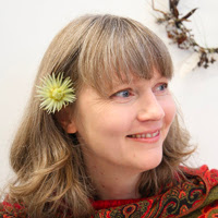
Welcome to Arcadia, a space for my fine art commentary on the local art scene in New Zealand, Australia and beyond. I am an artist from New Zealand currently living in Auckland. Some of my works can be viewed online at www.celeste.nz

Arcadia: A region of ancient Greece in the Peloponnesus. Its inhabitants, relatively isolated from the rest of the known civilized world, proverbially lived a simple, pastoral life.

A few years ago I exhibited some paintings under the title "Arcadia." They were large abstracts of different hues with fine lines of metallic leaf embedded, forming vague structures and connections. I wanted to evoke a sense of another realm, an "Arcadian" space. It also seemed appropriate to reference ancient Greece given the influence of classicism in various forms throughout art history.

In this realm, the blog which only exists in cyberspace, like the Aracadia of the imagination, the focus is simple - art in it's many and varied forms.